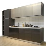
Sherwin-Williams' Most Popular Kitchen Colors
The kitchen, often considered the heart of the home, is a space where functionality meets aesthetics. Choosing the right color palette for a kitchen remodel or refresh can significantly impact the overall ambiance and perceived value of the property. Sherwin-Williams, a leading paint manufacturer, offers a vast array of colors, making the selection process potentially overwhelming. However, understanding their most popular kitchen colors and the reasons behind their enduring appeal can provide valuable guidance for homeowners and designers alike.
The popularity of specific colors within the Sherwin-Williams catalog is influenced by various factors, including current design trends, the availability of complementary materials, and the psychological effects that different colors have on occupants. A successful kitchen color scheme balances personal preferences with practical considerations such as lighting, cabinet styles, and countertop materials.
This article will explore several of Sherwin-Williams' most sought-after kitchen colors, examining their characteristics, potential applications, and why they resonate with homeowners seeking to create stylish and functional kitchen spaces. The focus will be on colors that have demonstrated long-term popularity, reflecting their versatility and adaptability to a range of design aesthetics.
Understanding the Appeal of Neutral Kitchen Colors
Neutral colors consistently rank among the most popular choices for kitchens. This enduring appeal stems from their versatility and ability to create a foundation upon which other design elements can be layered. Neutral colors, such as whites, grays, and beiges, offer a sense of timelessness and can be easily adapted to accommodate changing trends and personal preferences. Furthermore, they tend to maximize natural light, making kitchens appear larger and more inviting.
Within the neutral category, different shades and undertones can evoke distinct moods. Warm neutrals, such as creams and beiges, provide a sense of comfort and coziness. Cool neutrals, like grays and soft whites, offer a more modern and sophisticated aesthetic. The specific neutral chosen should complement the overall design style of the kitchen and the surrounding areas of the home.
One of Sherwin-Williams' consistently popular neutral kitchen colors is "Alabaster" (SW 7008). This off-white shade offers a subtle warmth that prevents it from feeling stark or clinical. It works well with a variety of cabinet styles, from traditional to contemporary, and pairs seamlessly with both warm and cool-toned countertops and backsplashes. Its versatility makes it a safe and reliable choice for homeowners seeking a classic and elegant kitchen.
Another notable neutral is "Accessible Beige" (SW 7036). This warm, muted beige offers a sophisticated alternative to stark white. It provides a grounding effect, making it suitable for larger kitchens or those with abundant natural light. Its earthy undertones create a sense of warmth and comfort, making it a popular choice for kitchens where people gather and spend time together. "Accessible Beige" works particularly well with natural wood elements and earthy-toned accents.
Gray, in its various shades, has also become a staple in kitchen design. Sherwin-Williams offers numerous popular gray options, including "Repose Gray" (SW 7015) and "Agreeable Gray" (SW 7029). "Repose Gray" is a light, cool gray with subtle warmth, making it incredibly versatile. "Agreeable Gray" is a warmer, greige (gray-beige) that offers a more comforting and inviting feel. Both grays serve as excellent backdrops for stainless steel appliances and modern cabinetry.
The advantage of using neutral colors lies in their ability to adapt to different design schemes. They can be easily paired with pops of color through accessories, appliances, or accent walls. This allows homeowners to personalize their kitchens without committing to a bold, potentially limiting, color palette.
The Allure of Blue and Green Kitchen Colors
While neutrals offer a timeless foundation, blue and green hues have gained significant popularity in recent years as homeowners seek to infuse their kitchens with personality and a connection to nature. These colors evoke feelings of calmness, serenity, and freshness, creating a welcoming and relaxing atmosphere. The versatility of blue and green allows them to be incorporated into a variety of kitchen styles, from coastal to farmhouse to modern.
Sherwin-Williams offers a diverse range of blue and green shades, each with its unique characteristics and appeal. Lighter blues and greens can create a sense of spaciousness and airiness, while darker shades offer a more dramatic and sophisticated look. The specific shade chosen should complement the natural light in the kitchen and the overall design aesthetic.
"Sea Salt" (SW 6204) is a consistently popular light green-blue shade. This muted, calming color evokes a sense of tranquility and is reminiscent of coastal living. Its subtle undertones create a soft and inviting atmosphere, making it a popular choice for kitchens in homes with a relaxed and welcoming style. "Sea Salt" pairs well with white cabinetry, natural wood accents, and coastal-inspired decor.
"Naval" (SW 6244) is a deep, rich navy blue that has gained immense popularity as an accent color or for kitchen islands and lower cabinets. This bold hue adds a touch of sophistication and drama to any kitchen. Its depth and richness create a sense of luxury and elegance. "Naval" works particularly well with white or light-colored countertops and hardware, creating a striking contrast.
"Evergreen Fog" (SW 9130), Sherwin-Williams’ 2022 Color of the Year, remains a popular choice for those seeking a sophisticated and nature-inspired green. This mid-tone gray-green offers a sense of calm and tranquility, bringing the outdoors in. Its versatility allows it to work well in both traditional and modern kitchens, and it pairs beautifully with natural wood tones and brass accents.
The success of blue and green kitchen colors lies in their ability to create a sense of connection to nature and a feeling of serenity. These colors can transform a kitchen into a welcoming and relaxing space where people enjoy spending time.
The Enduring Relevance of White Kitchens
White kitchens have remained a consistently popular choice for decades, and for good reason. White provides a clean, bright, and timeless aesthetic that appeals to a wide range of homeowners. It maximizes natural light, making kitchens appear larger and more airy. White also serves as a blank canvas, allowing for the easy integration of different design styles and personal preferences.
While the concept of a white kitchen may seem straightforward, the reality is that there are numerous shades and undertones of white, each with its own unique characteristics. Choosing the right white is crucial to achieving the desired look and feel. Some whites are warmer, with yellow or cream undertones, while others are cooler, with blue or gray undertones. The specific white chosen should complement the lighting, architectural style, and existing materials in the kitchen.
"Pure White" (SW 7005) is a highly versatile and popular white shade. Its clean, crisp appearance provides a modern and timeless aesthetic. It works well with a variety of cabinet styles and complements both warm and cool-toned countertops and backsplashes. "Pure White" is a popular choice for homeowners seeking a bright and airy kitchen.
"Snowbound" (SW 6383) is another popular white option that leans towards a slightly warmer tone. It offers a soft and inviting feel, making it a great choice for kitchens where people gather and spend time together. "Snowbound" pairs well with natural wood accents and warm-toned hardware.
The enduring appeal of white kitchens lies in their versatility, timelessness, and ability to create a bright and inviting space. White provides a clean and uncluttered aesthetic that can be easily personalized with different accents and accessories. It also enhances natural light, making kitchens appear larger and more spacious.
Selecting the right Sherwin-Williams kitchen color involves careful consideration of several factors, including personal preferences, design style, lighting conditions, and existing materials. By understanding the characteristics of popular colors and their potential applications, homeowners and designers can make informed decisions that create beautiful and functional kitchen spaces.
The colors discussed, while consistently popular, represent just a small fraction of the vast array of options available from Sherwin-Williams. Exploring different shades and undertones is crucial to finding the perfect color palette for a specific kitchen project. Consulting with a paint professional or utilizing online color visualization tools can further assist in the selection process.

5 Fresh Kitchen Colors Sherwin Williams

5 Fresh Kitchen Colors Sherwin Williams

5 Fresh Kitchen Colors Sherwin Williams

5 Fresh Kitchen Colors Sherwin Williams

5 Fresh Kitchen Colors Sherwin Williams

Popular Kitchen Cabinet Paint Colors West Magnolia Charm

Paint Color Inspiration For Kitchens Sherwin Williams Painted Kitchen Cabinets Colors Cabinet

40 Sage Green Kitchen Cabinets With Paint Colors Jenna Sue Design

Top Kitchen Cabinet Paint Colors From Sherwin Williams

The Best Sherwin Williams White Paint Colors For Cabinets